To begin, I have never been challenged to view art in this particular way. Not to say that I’ve never done so, but examining art to this extent is very new to me.
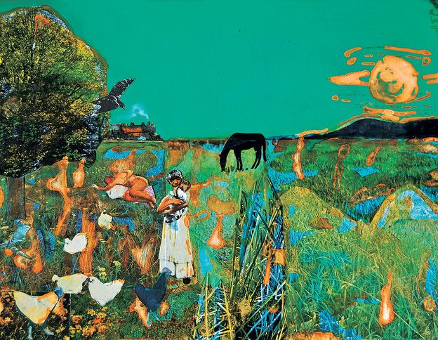
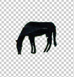
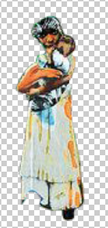
For this assignment, we visited the High Museum of Art and viewed the Romare Bearden exhibit. From this exhibit, we were to choose an image that we really liked. Below is my chosen image.
Romare Bearden
During our time at the High, we also had to write out all of our observations on this piece. It now makes more sense as to why we were doing this but in the museum, we were only allowed to describe the piece using the basic elements of art. For example, I wrote “circular, organic, textured… lump” instead of “tree”. This process helped to fully realize the composition of the piece and not just the visual objects and people within it. Describing it as if it’s over the radio.
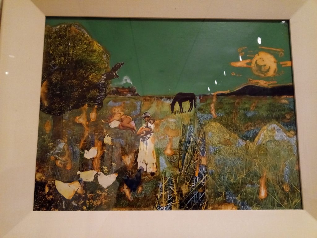
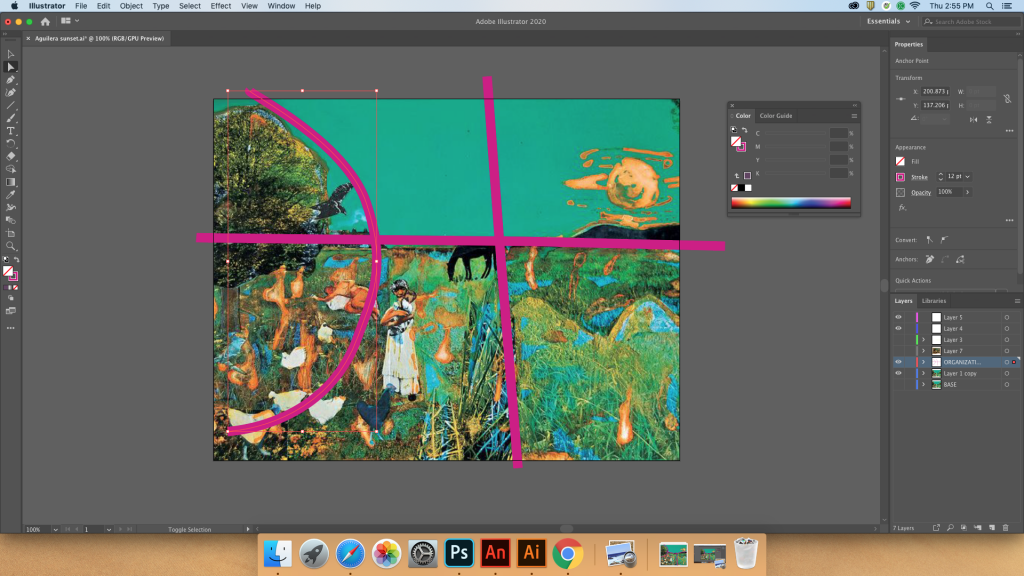
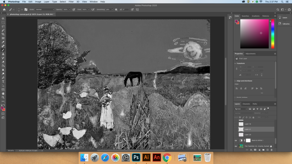
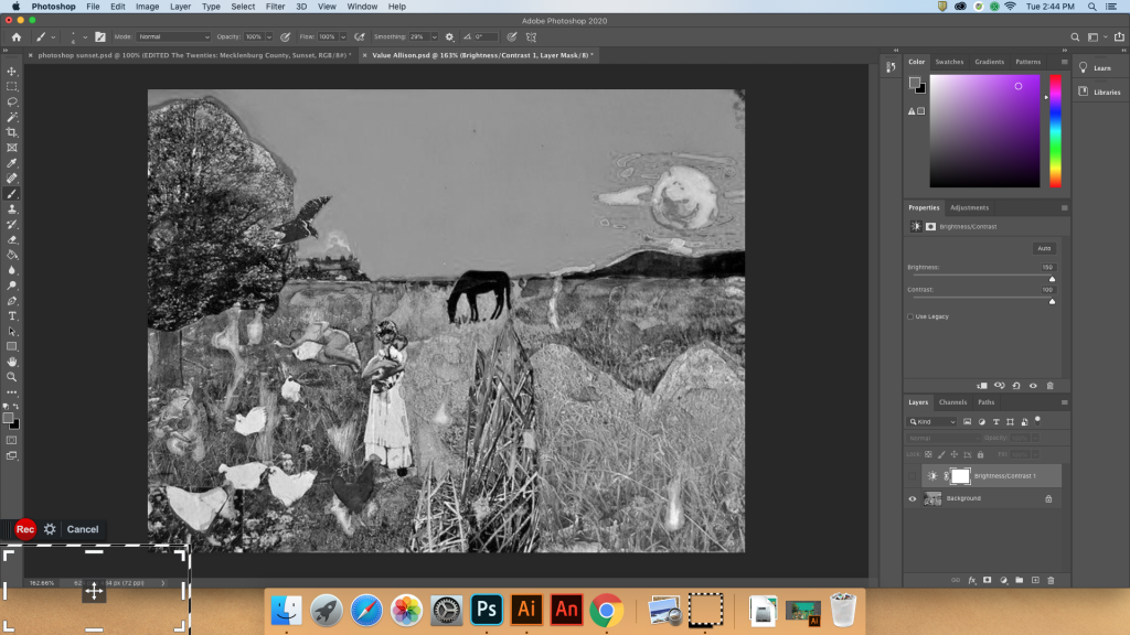
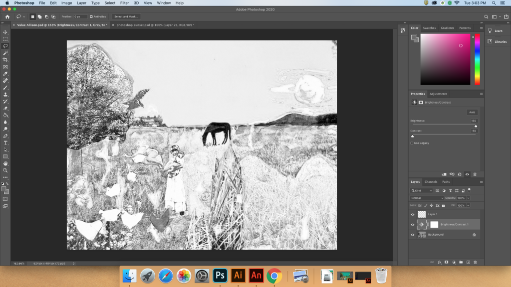
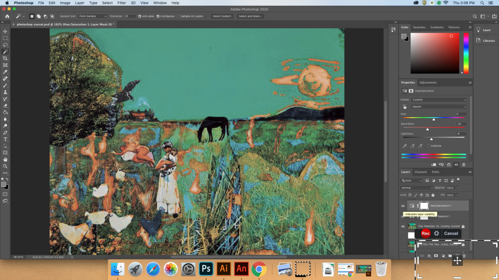
We then put this image in Photoshop and messed around with it. Since I am very familiar with Photoshop, and for Art 244, I also placed the image in Adobe Illustrator. This was not my first time using Illustrator, but it might as well have been. I found it to be a bit frustrating but it eventually began to make sense as I familiarized myself with the new tools. I also learned the difference between a vector and a rasterized image! (The former is made up of points and the latter is comprised of pixels.)
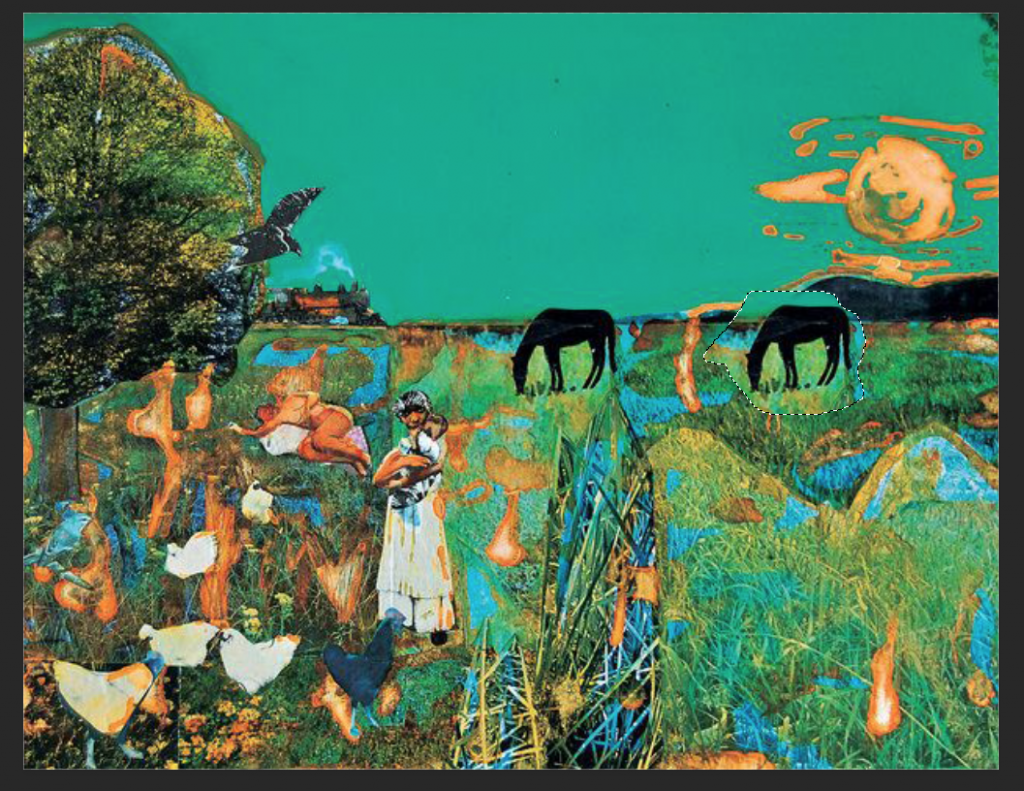
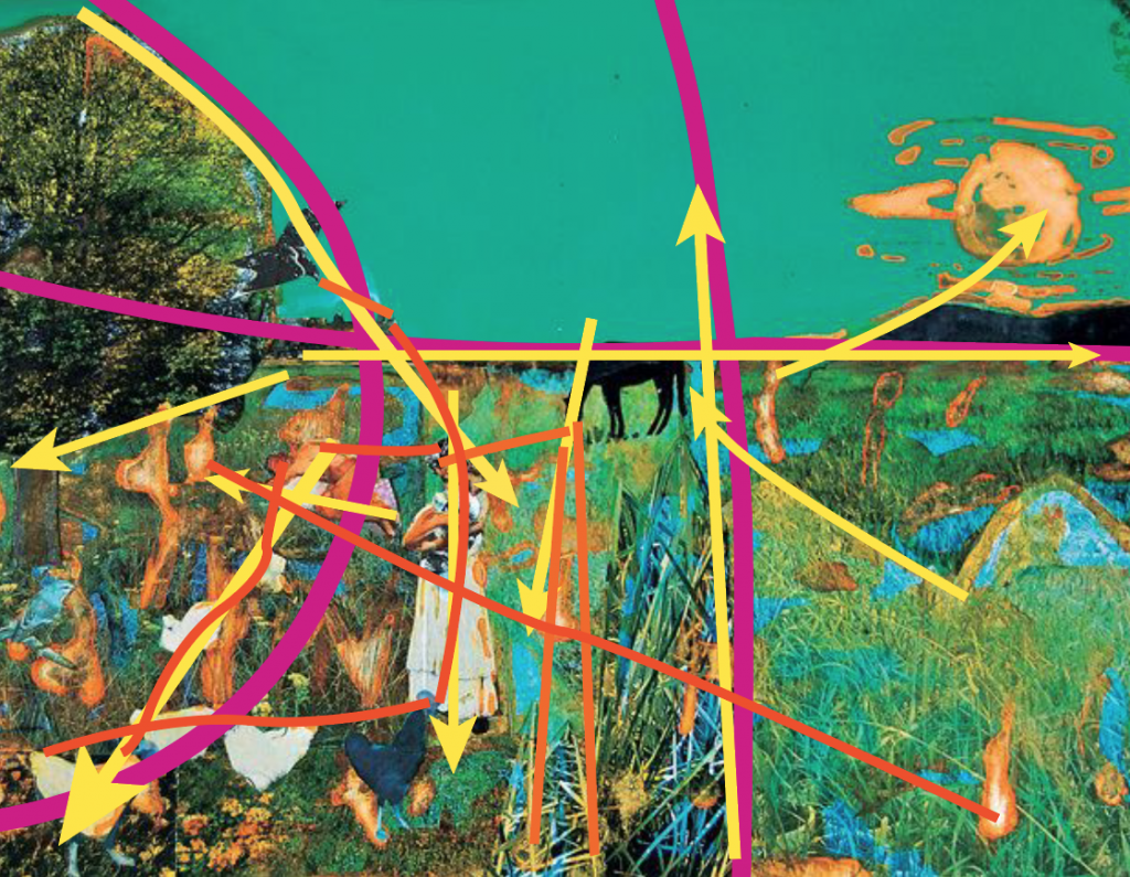
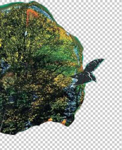
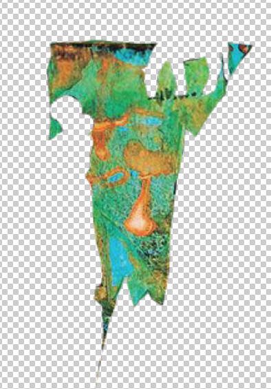
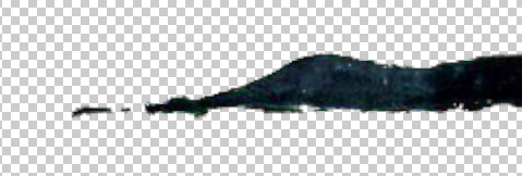
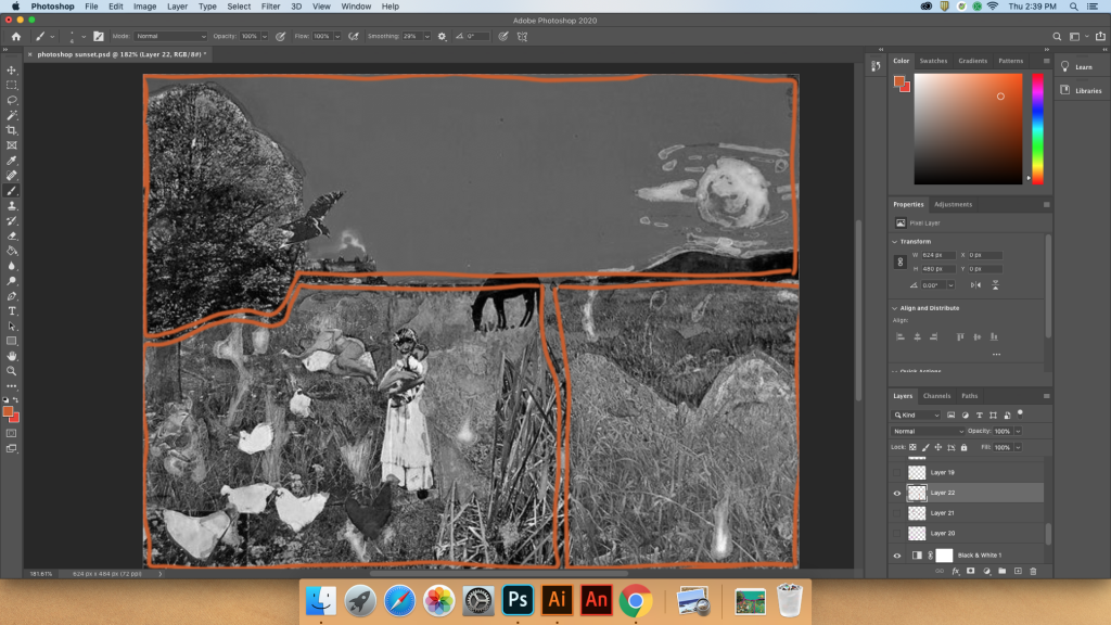
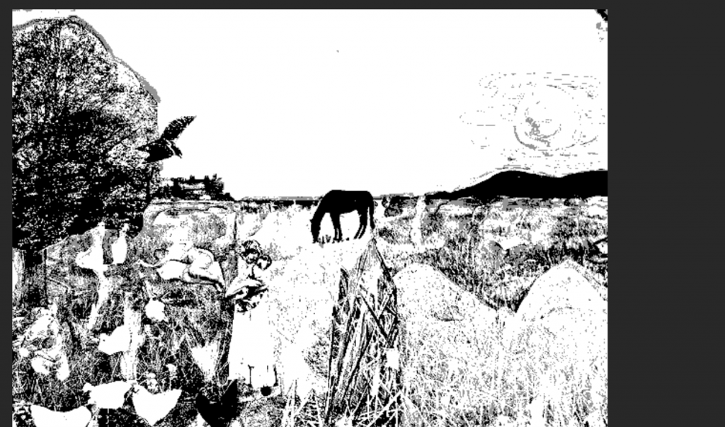
Staring at a piece for 30 minutes straight will do some things to the way you see it. The next part was about identifying organizational lines. I immediately noticed this composition was split into two very distinct parts separated by the horizon. There was also a hard vertical line 2/3 across the field from the left. Finally, I recognized a curve created by the tree and continued with the line of chickens. It took some time for me to recognize all of these pieces, and distinguish them as the most prominent components of the organization. I learned that taking some time away from it and then looking back and being aware of what your eyes follow first helps to distinguish the organizational lines. Zooming out and blurring your visions helps you to recognize the most distinguishing elements of the piece as well.
Line
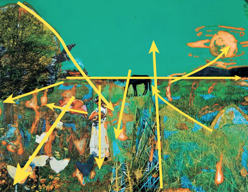
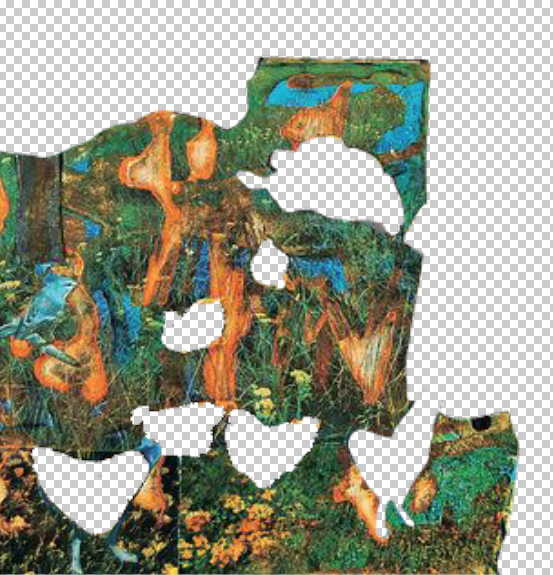
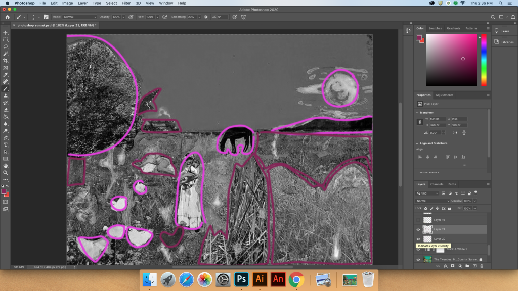
Above, I gave an image for my organizational lines, which divide the image into the most basic distinguishing sections. Next, I identified directional and implied lines. Directional lines are what guide the eye off of one object and onto the next based on the direction that they are facing. Implied lines are not necessarily connecting lines, but lines that are formed based on where one object might connect or relate to another. All of these concepts overlap to a degree but are also subjective. These were all completed in Adobe Illustrator.
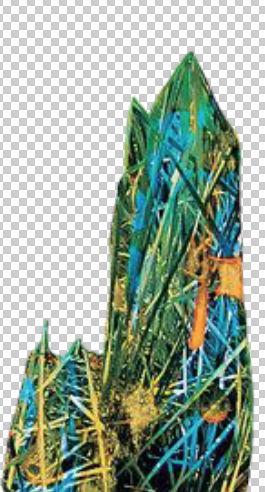
Shape
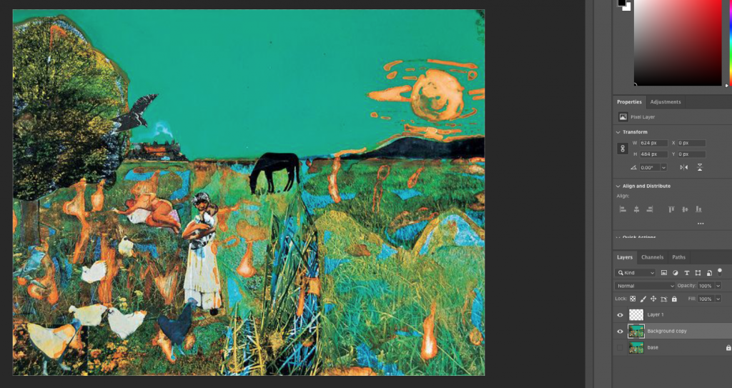
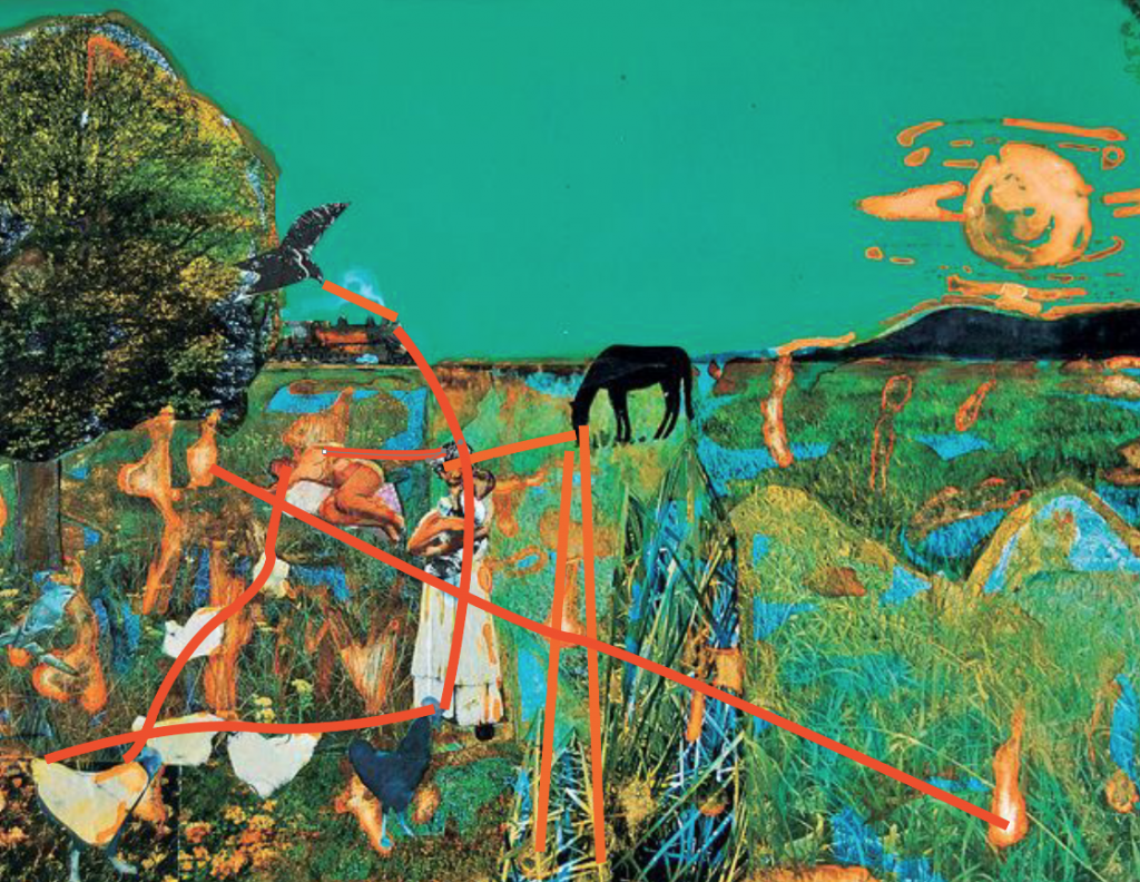
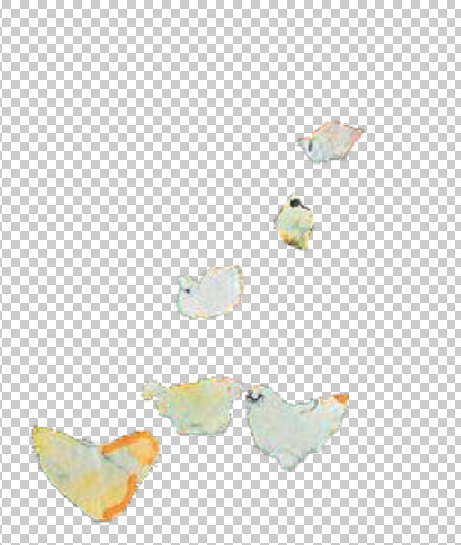
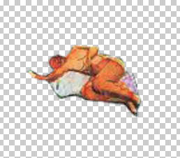
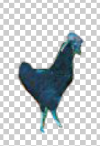
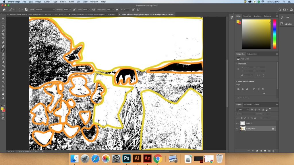
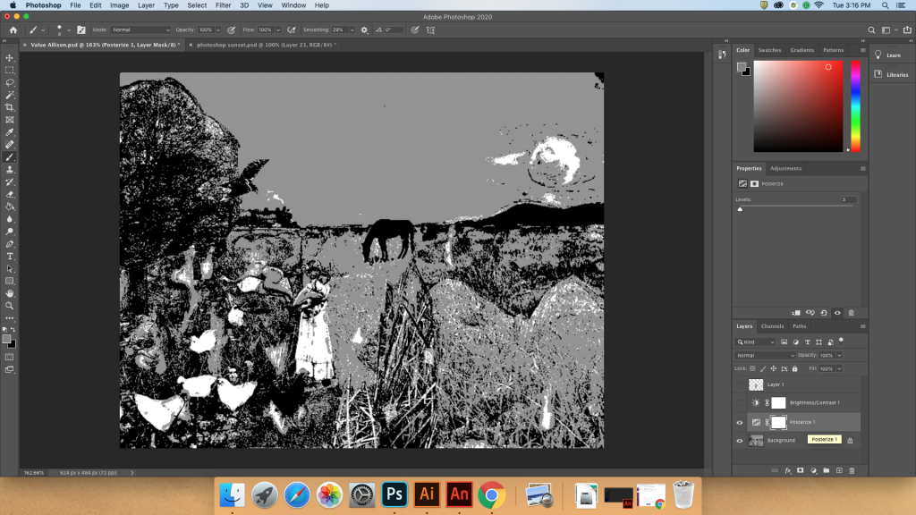
Here, I was deconstructing the image through shapes- individual shapes that stood out the most based on their surroundings. These were distinguished using Photoshop’s lasso and selection tools.
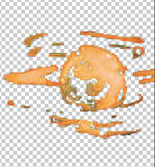
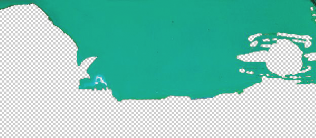
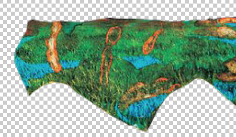
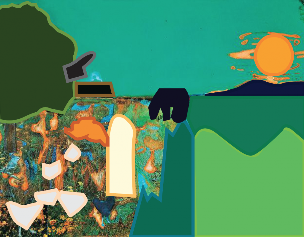
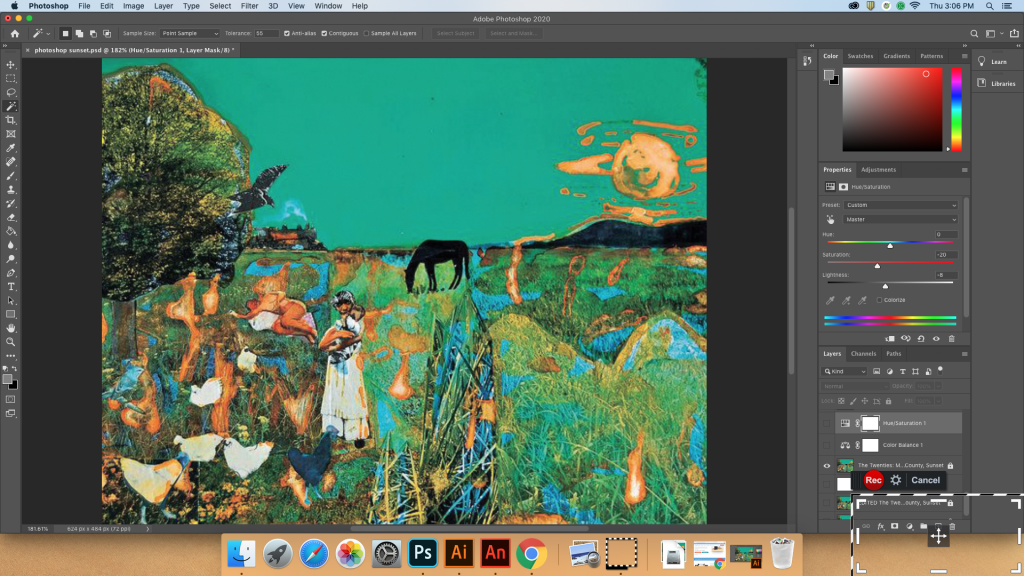
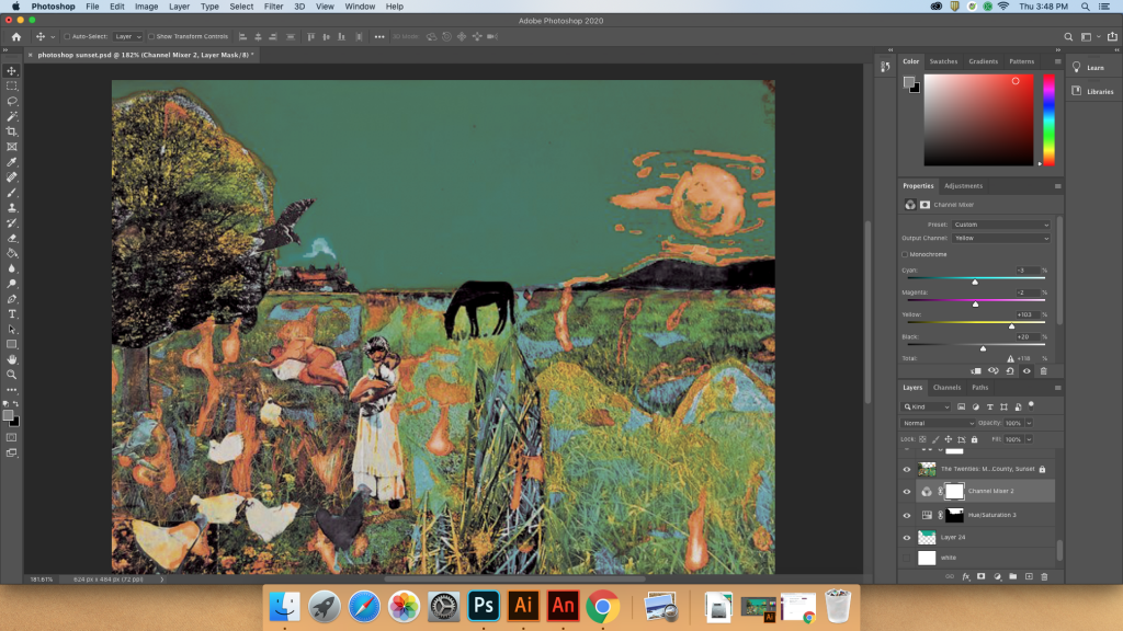
Color
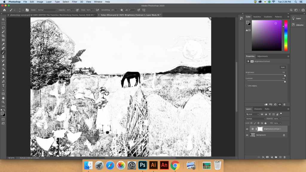
The photo I was working with was extremely saturated and by muting the colors using various adjustment filters in Photoshop, I was able to get a more accurate image.

Making a formal analysis using elements and principles of art allows a viewer to asses the construction of the image. In this project, deconstructing through formally identifying the shapes, colors, and lines opened me up to seeing art in a new way. I previously didn’t really look for particular shapes or lines, but I have always been very attracted to colors in a piece. Because of this exercise, I can analyze the reasons as to why artwork is visually interesting and how it is constructed.
Leave a Reply