To explore negative shapes, spaces and Photoshop itself, our first project of Art 144 was to choose a letter, font, and crop it on at least three sides. From there we were to create equivocal and unequivocal images from these shapes. Here, I started with a ‘g’ and made separate layers for each of the negative spaces.


I began by moving the shapes around more than transforming them, and after experimenting a bit, I found a sort of landscape. After manipulating the opacity, I had begun to create a sky out of the negative space.


The previous piece had a small protagonist in the lower right. I really liked the idea of creating a narrative for this character, so I played with the value around the ‘g’ and selected a particular space to create the glowing eye of a monster focused on the protagonist.


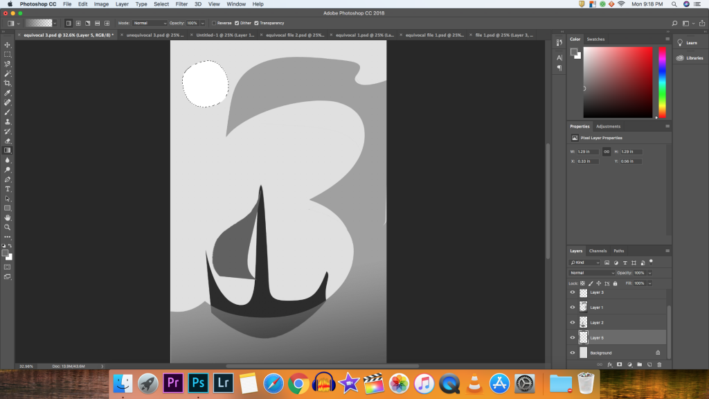
Continuing the narrative theme, I realized the outside shape of the ‘g’ could look a bit like water. I used a lot of the transformation tool, and especially the stretching tool to move the water and create a boat. I then edited the sky and wave to have a gradient, then the wave and sail with opacity.

Here, the same protagonist triangle explores a dark cavern. The gradient and opacity tools were useful when creating the illusion of a glowing lantern and the stalagmites that the character passes as they journey. I had some difficulty with the quality of the triangle after expanding it so much. I decided to leave it as is because it added some variety to the very clean, sharp shapes.


I had some difficulty with this piece, I was unsatisfied for a while. Eventually, I found a configuration with the warping tool and made it look like a genie.


I liked the glowing effect from the second piece, so I experimented with it more by selecting several areas and filling the spaces with different tints and shades. Then filling the white spaces with corresponding tints and shades. I found another tool to make the edges of the ‘g’ foggy.

For the next four equivocal and unequivocal pieces, I used the letter ‘R’ and once again cropped and rotated it. Then used each sectioned area to transform for the project.


Modified in rotation, opacity, and color, this piece is simple, but I’m quite satisfied with how it turned out. It gives the effect of a logo being shone up in the sky.


I really just wanted to see how far I could manipulate the ‘R’ using the warping tool. I also think that the change in the eye of the letter draws the viewer to focus on the space around the ‘R’ more than the letter itself.


I hadn’t focused so much on opacity in the other pieces. Without transforming each shape too drastically from the original, I moved them around for a more balanced image and made sure that the overlap of opacity was visible.


Using tints, shades and the gradient was essential to creating an illusion of a glowing piece illuminating other unidentified shapes. Again, I selected an area to create the light ray but considered the proximity of the objects when changing their value.
The combined and finished pieces:


Leave a Reply