Book Cover and Flyer Designs
I was intrigued by this assignment’s artist influences as well as the prospect of recreating covers for my favorite books. Hannah Hoch’s DaDa style of collages is grotesque but intriguing, and Raoul Hausmann’s is continuously surreal. I decided to use one or both of these artists as influences. I struggled to choose between two books, though: I’ll Give You the Sun by Jandy Nelson, and Slaughterhouse-Five by Kurt Vonnegut.
I first found several pictures that applied to each book and experimented with the positions and cropping of different parts of the image. I found that Hannah Hoch’s inherently strange style was great for I’ll Give You the Sun, so I played around with the design of the twins that are in the novel. These twins tell two halves of the same story, so I wanted to combine them in a twisting way in the style of Hoch.

I was enjoying this process, but after reviewing the different artists, I decided that Slaughterhouse-Five had themes that were more in line with the time period of the Photomontage movement. The collages of Raoul Hausmann would fit very well with the disassociated state that is so present in the novel. So, I started over with images pertaining to Slaughterhouse-Five by Kurt Vonnegut.


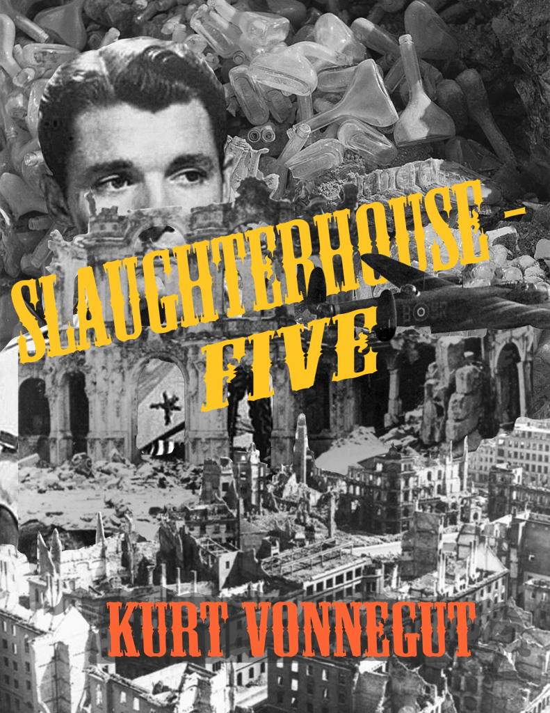
This design came very naturally. Raoul Hausmann’s photomontage images repeatedly focus on the mind, subconscious, and invention as does the novel. Taking place in World War II, Billy Pilgrim witnesses the destruction caused at the bombing of Dresden. The entire book is told out of chronological order due to Billy’s ability to “fall out of time”.
All of this is, I find very appropriate and suited for the style of Raoul Hausmann. I then went on to create the flyer for the book event as pictured below.

This flyer includes Kurt Vonnegut’s signature: a small self-portrait.

The second book cover focused more on the psychological aspect of the book and still includes images from the bombing of Dresden. It follows the same black and white scheme, and originally, it was all black and white, but I changed the title to yellow. This was a change made on the part of my class’s critiques. A white banned that was behind the title was a bit distracting, so I got rid of the white and made it yellow.
Below is the book poster that I used the original book design for because of the way it stood out.

Here are my finished covers in full:


I really enjoyed this project; it gave me the opportunity to try a style that I have never tried before and that I’m very new to. It also gave me the opportunity to revisit the books that I have enjoyed reading so much.
Leave a Reply